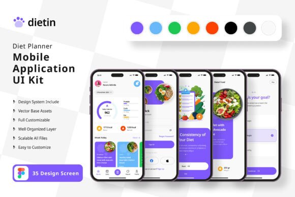
Build Your Diet App Faster with This Comprehensive UI Kit
Creating a diet or nutrition tracking application from scratch is a massive undertaking. Beyond the backend logic and data management, there's the entire user interface to design—screens for logging meals, tracking calories, setting goals, viewing progress charts, and managing user profiles. This is where a well-crafted UI kit becomes an invaluable asset for designers and developers alike. The Diet Planner Application Mobile UI KIT offers a practical shortcut, providing a library of 35 meticulously designed screens that serve as a foundation for your project.
A Foundation for Visual Consistency
One of the biggest challenges in app development is maintaining a cohesive look and feel across dozens of screens. A button style on the home screen should match the one in the settings menu. The typography for headings needs to be uniform. The color palette should be applied consistently to create a seamless user experience. This UI kit solves that problem from the outset. With over 80 reusable UI elements—think buttons, input fields, cards, navigation bars, and icons—every component is designed to work together. This isn't just about saving time on drawing rectangles and circles; it's about establishing a professional, unified visual language for your entire application right from the first prototype.
Because the kit is built with 100% vector layers in Figma, you're not locked into the original design. Every element is fully editable. You can easily change the color scheme to match your brand's palette, adjust spacing, swap out icons, or modify the layout of a screen to better fit your specific feature set. This flexibility is crucial. Your diet app might focus on keto, intermittent fasting, or general calorie counting, and each concept might benefit from a slightly different visual emphasis. The template provides the structure; you provide the unique vision.
Practical Applications Beyond the Initial Build
While the primary use is building a mobile application, the value of a comprehensive design system extends further. The screens and components can be repurposed for a variety of related projects, streamlining your workflow across different media.
- Marketing and Brand Assets: Use the app screens as high-fidelity mockups for your website, pitch deck, or investor presentations. Showcase your app's user interface in a realistic context before a single line of code is written.
- Social Media Graphics: Extract individual elements or composite screens to create engaging social media content. A beautifully designed progress chart or a clean meal logging interface can make for compelling Instagram Stories or LinkedIn posts that highlight your app's features.
- Blog and Editorial Content: If you're writing articles about nutrition, fitness, or healthy living, these UI designs can serve as custom illustrations. Instead of using generic stock photos, you can feature visuals that directly represent the digital tool you're discussing or building.
- Pitching and Collaboration: For freelancers and agencies, presenting a client with a clickable prototype made from this kit is far more effective than describing screens with words. It bridges the gap between idea and execution, facilitating clearer feedback and faster decision-making.
Key Features That Support a Streamlined Workflow
Several technical aspects of this kit are designed to make your life easier. The use of Symbol Objects in Figma means you can create master components—like a specific button style or a header—and update it once to see the change reflected across every screen where it's used. This is a massive time-saver during the design refinement phase.
The inclusion of free fonts and icon vectors is a thoughtful touch. It removes the immediate hurdle of sourcing and licensing additional assets, allowing you to get started with the kit right away. The 100% scalable vectors ensure that your designs will look crisp on any device screen, from a small smartphone to a larger tablet, which is essential for modern app development. The fully layered structure of the Figma file also means it's organized and easy to navigate, even for someone new to the project. You won't be digging through a messy file to find the screen you need to edit.
A Note on Imagery: It's important to remember that the preview images showing food, people, and charts are for demonstration only. They are not included in the download. This is standard practice, as it encourages you to use your own branded photography or source images that are legally cleared for your project, ensuring your final app has a unique and authentic visual identity.
Who Stands to Benefit Most?
This resource is particularly valuable for a few key groups. Entrepreneurs and startup founders with a diet app idea can use it to rapidly create a functional prototype for user testing or to secure funding, dramatically reducing the initial design timeline. Freelance UI/UX designers can leverage it as a starting point for client projects, allowing them to deliver polished mockups quickly and allocate more time to user research and interaction design. Mobile developers who are comfortable with design but want to accelerate the process will find the ready-made components a perfect bridge between concept and implementation.
Ultimately, the Diet Planner Application Mobile UI KIT is a practical design asset. It doesn't build the app for you, but it removes one of the most time-consuming initial hurdles. By providing a solid, customizable foundation of screens and components, it allows you to focus your creative energy on what makes your application unique—the specific features, user experience flows, and brand personality that will set it apart in a crowded market.