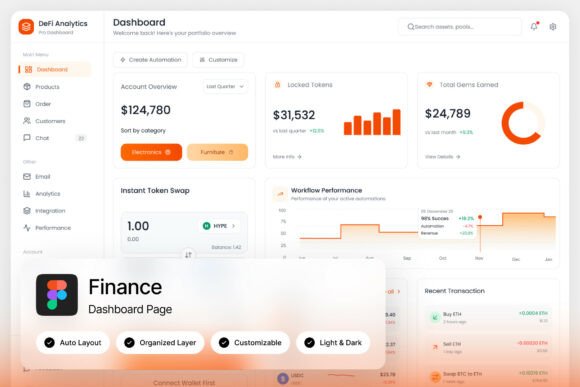
Finova Analytics Dashboard: Clean Design for Smart Finance
Imagine opening your banking app and instantly understanding your financial health—no clutter, no confusion, just clear insights presented in a way that feels both modern and trustworthy. That’s the core appeal of the Finova Analytics Dashboard, a thoughtfully crafted UI kit that balances aesthetic elegance with practical functionality. Whether you're building a fintech startup, designing a mobile banking interface, or creating a personal finance tool, the right visual foundation can make or break user trust and engagement.
A Fresh Take on Financial Visualization
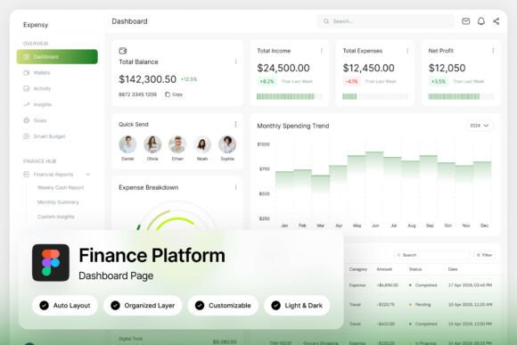
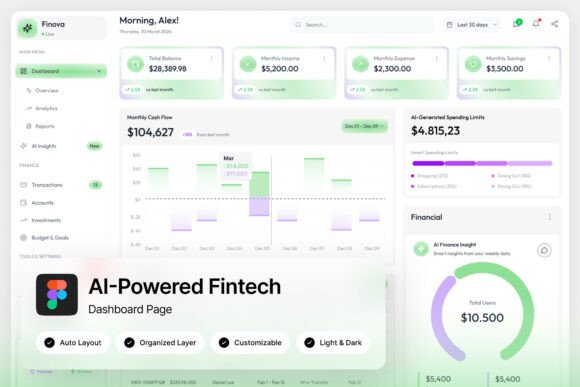
Finova stands out with its light, airy theme built around a harmonious green-and-white palette. This isn’t just about looking good—it’s about creating an environment where users feel calm and in control. The green tones evoke growth, stability, and positive financial movement, while the clean white space ensures information hierarchy remains clear. Circular progress indicators for savings goals or spending limits provide intuitive visual feedback, and the transaction lists are designed for quick scanning without overwhelming the eye.
What makes this dashboard particularly useful for designers and developers is its balance between beauty and usability. The layout prioritizes the data that matters most: wallet balances, spending analytics, and income tracking are all presented upfront. This approach aligns with modern user expectations—people want to glance at their phone and immediately grasp their financial status without digging through menus.
Beyond Fintech: Adapting the Dashboard Aesthetic for Various Projects
While Finova is designed for neobank and personal finance applications, its clean, modern typography and structured layout principles can inspire a wide range of creative projects. Think about how its visual language could translate to other contexts where clarity and professionalism are key.
For instance, the same principles of clear data visualization and intuitive navigation apply to:
- Brand Identity Systems: The dashboard’s consistent use of color, spacing, and typography could inform a broader brand guideline, especially for companies in the tech, finance, or health sectors where trust and clarity are paramount.
- Editorial and Packaging Design: Imagine a magazine spread or product packaging that uses similar progress indicators or clean data blocks to communicate features or benefits. The structured yet friendly aesthetic works well for annual reports, product labels, or informational brochures.
- Digital Products and Marketing Assets: The interface’s modern typography and balanced composition are ideal for designing mobile app screens, website dashboards, or even social media graphics that need to convey complex information simply.
The key takeaway here isn’t to copy the dashboard pixel-for-pixel, but to understand the design decisions behind it—how color, type, and layout work together to guide the user’s eye and reduce cognitive load.
Typography That Builds Trust and Readability
A critical component of Finova’s effectiveness is its typography. The UI kit includes free Google Fonts, which speaks to a practical, accessible approach to design. For any project—whether it’s a startup’s logo, a blog’s header, or a marketing brochure—font choice directly impacts readability and brand perception.
When selecting fonts for your own projects, consider these practical tips inspired by dashboard design:
- Prioritize Legibility at All Sizes: A font might look stunning in a headline but become unreadable in body text. Test your chosen typeface at various sizes, especially for mobile screens or printed materials where space is limited.
- Match Typography to Project Goals: A fintech dashboard uses clean sans-serif fonts for a modern, approachable feel. If you’re designing for a luxury brand, a refined serif might be more appropriate. Always align your type choices with the emotion and message you want to convey.
- Explore Effective Font Pairings: Finova likely uses a combination of font weights and styles to create hierarchy without visual chaos. Try pairing a bold display font for headings with a neutral, highly readable sans-serif for body text. Tools like Google Fonts’ pairing suggestions can be a great starting point.
Remember, the goal of typography in any context is communication. A beautiful font that hinders readability fails its primary purpose. Always test your designs in real-world conditions—on different devices, in print, and with your target audience in mind.
Practical Implementation and Customization
For designers and teams adopting a resource like the Finova dashboard, the included Figma file and organized layers are invaluable. This level of preparation saves hours of setup time and allows for immediate customization. You can quickly adapt the color scheme to match a client’s brand, swap out fonts, or rearrange components to fit a different layout.
This kind of modular design thinking is applicable beyond UI kits. When creating any design asset—a social media template, a presentation deck, or a product mockup—building with organized, named layers makes future edits seamless. It’s a professional practice that enhances collaboration and ensures consistency across all brand touchpoints.
Furthermore, the inclusion of both light and dark mode interfaces is a lesson in thoughtful design. It acknowledges that users have different preferences and contexts for using an app or viewing content. When developing your own materials, consider how your designs will adapt to various environments, whether it’s a dark-themed website or a printed piece under bright lighting.
Final Thoughts on Leveraging Clean Design Systems
Finova Analytics Dashboard is more than just a set of screens; it’s a case study in how thoughtful design can simplify complexity. Its strength lies in its restraint—using a limited color palette, clear typography, and intuitive data presentation to create an experience that feels both professional and personal.
For anyone involved in visual communication—whether you’re a solo entrepreneur crafting your brand’s first website, a marketer designing campaign assets, or a developer building a user-centric app—the principles embodied in this dashboard are universally valuable. Focus on clarity, maintain visual consistency, and always design with the end user’s needs and comfort in mind. By doing so, you create not just attractive designs, but tools that people genuinely want to use.