Mastering the Digital Trading Floor with LYTRON
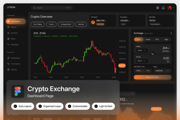
You're staring at a screen filled with numbers, charts, and rapid-fire data. In the world of active cryptocurrency trading, clarity isn't just a luxury; it's the difference between a confident decision and a missed opportunity. This is the exact problem the LYTRON Crypto Exchange Dashboard was built to solve. It’s not merely a collection of screens; it’s a carefully crafted environment designed for focus, speed, and precision. Imagine a command center where every element, from the deep black background that reduces glare to the strategic pops of orange that highlight critical data, works in concert to guide your eye and support your workflow.
A Visual Language Built for Confidence
What immediately sets this interface apart is its uncompromising design philosophy. The dark, high-energy theme does more than look sleek—it serves a functional purpose. A dark UI minimizes eye strain during those long analysis sessions and makes data visualizations like candlestick charts truly pop. The orange accents aren't arbitrary; they’re a classic color of action and urgency, used here to draw attention to price changes, active orders, and key portfolio metrics. This isn't just a pretty mockup; it's a study in how color psychology and layout hierarchy can create a tool that feels powerful to use. For a developer building a DeFi platform or a designer creating a brand identity for a blockchain startup, this dashboard provides a masterclass in presenting complex information with elegance and authority.
From Trading Terminal to Brand Foundation
While its primary purpose is as a crypto exchange interface, the design principles within LYTRON have far-reaching applications for any project that needs to convey sophistication and technical prowess. Think about the visual identity of a fintech app, a data analytics SaaS product, or even a modern financial blog. The clean, pixel-perfect layouts and well-organized layers in the Figma file make it an exceptional starting point. You could extract the color palette—a moody, professional spectrum anchored by black and vibrant orange—and apply it to your logo design, packaging, or social media graphics. The typography choices, featuring free Google Fonts, offer a blend of modern sans-serifs for data and clean serifs for headings, providing a ready-made font pairing strategy that ensures readability across a website, mobile app, or printed report.
Practical Toolkit for the Modern Designer
Let's talk about what you actually get and how to use it. The ZIP file includes two high-resolution screens (1440×1024 px), giving you a comprehensive view of a trader's journey. The "fully customizable with easy editing" promise is key here. Because the layers are named and grouped logically, you can quickly adapt the components. Swap out the crypto icons for your own product icons. Change the chart data to represent your business metrics. Adjust the orange highlight to match your brand's signature color. This turns the dashboard from a static concept into a dynamic design asset. For a content creator, you could use a stylized chart panel as a striking background for a YouTube video on market trends. For a small business owner launching a new service, the portfolio analytics section could inspire a clean, data-driven layout for your website's pricing page.
Ensuring Your Project Stands Out
In a sea of generic templates, using a specialized resource like this dashboard can be a strategic advantage. Its "unique, stylish, and modern design" helps you avoid the clichés of overused design trends. When you present a client with a website mockup or a marketing brochure that uses this level of detail and cohesion, it immediately elevates your professional presentation. The included Light and Dark mode interface is a thoughtful touch, allowing you to test how your designs perform in different viewing contexts—critical for web design and digital product development. Remember, the goal isn't to create a carbon copy of a trading platform, but to harness its underlying principles of clarity, hierarchy, and visual consistency to strengthen your own brand recognition and audience engagement.
Smart Implementation for Lasting Impact
Before you dive in, consider these practical tips. First, always test your chosen font pairings in context. The Google Fonts included are versatile, but see how they hold up at small sizes on a mobile screen or in a large headline on a poster. Second, while the design is bold, ensure your final application maintains excellent readability. The high contrast of the original design is great for data, but you might need to adjust it for long-form text in an editorial layout. Finally, respect the commercial licensing. The assets are provided for your creative and commercial projects, but the preview images are just that—previews. Use the Figma file and the design language it provides to build something uniquely yours, whether that's a complete brand identity system, a series of eye-catching social media posts, or a groundbreaking digital product interface. It’s a toolkit designed to help you communicate complex ideas with confidence and visual punch.